When users need
clarity the most.
MED already existed. The flow already existed. What was missing was someone translating it for a person who had just been scammed.
A regulatory obligation that wasn't reaching the people who needed it.
MED, the Special Refund Mechanism, is the tool Brazil's Central Bank created for people who fall victim to scams or fraud via Pix. Every institution that operates Pix is required to offer it. We already had it.
The problem wasn't having it or not. It was how it reached the people who needed it most: someone who had just lost money, probably panicking, trying to figure out if there was any way to get it back. That person landed in a flow that didn't explain the process, didn't say how long it would take, and gave no feedback at all once opened. The only way out was to call support and wait.
On the inside, it wasn't well solved either. The process needed a shared language across teams and full compliance with the Central Bank's guidelines.
The pain had two sides, and each paid a different price.
For the person disputing: not knowing if their case applied, having no idea of the timeline, feeling the request vanished once sent, and depending entirely on support for any news. All of this at a moment of anxiety and insecurity.
Inside the company: a high volume of tickets asking basically the same thing ("what's the status of my dispute?"), growing support effort, a process that needed a shared language across teams, and an experience that weighed on exactly the most sensitive moments of the customer relationship.
Core insight
The problem wasn't missing functionality. It was missing understanding. MED existed. The flow existed. It just needed someone to translate it for the person on the other side of the screen.
Replace the feeling of abandonment with continuous tracking.
The process itself couldn't be simplified. It's regulated, has a fixed deadline and specific Central Bank rules. What could change was how much the user understood about what was happening. I designed around four things the person needed to be able to do:
- Understand whether their case was eligible for MED before opening any request
- Know exactly which step the dispute was at, without having to call
- Have real predictability about the next steps and the deadlines involved
- Check the full history of any dispute, at any time
End-to-end design in a critical, regulated flow.
I led the full redesign, from discovery to the two versions that went live. That meant working closely with legal and compliance to ensure regulatory compliance, with operations to understand the real support bottlenecks, and with engineering to make a real-time status system possible.
Two fronts at once: the flow, and what comes after it.
Most regulatory redesigns stop at "open the request". Here, what came after was just as important.
Mapping the existing flow and its gaps
Analysis of the current process, interviews with the support team, close reading of the Central Bank's MED guidelines.
Triage of eligible cases
A clear distinction between fraud/scam and operational failure. The 80-day deadline, exceptions, and the cases that simply aren't covered.
Redesigning the opening flow
Standardized language across teams, guided triage, and structured data submission to the Central Bank.
Real-time tracking system
A hub with progressive status and centralized history, viewable right in the app, without depending on anyone on the other end of the line.
Validation with support and compliance
Review with customer service and legal before launch, to make sure the language matched operational reality.
From opening a ticket and waiting to following a process with clarity.
The MVP solved the opening: eligibility explained before anything else, the reason picked in plain language, supporting documents uploaded, and a clear confirmation of what came next.
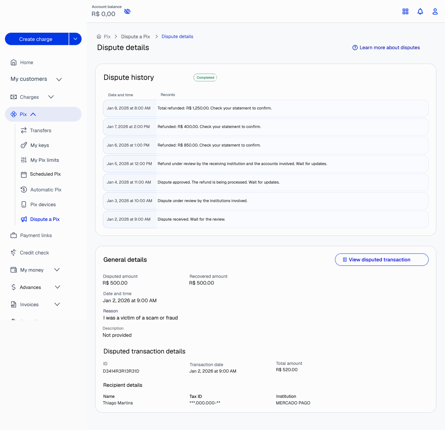
V2 solved what came after: the tracking hub, where the person checks status, history and recovered amounts without opening another ticket.
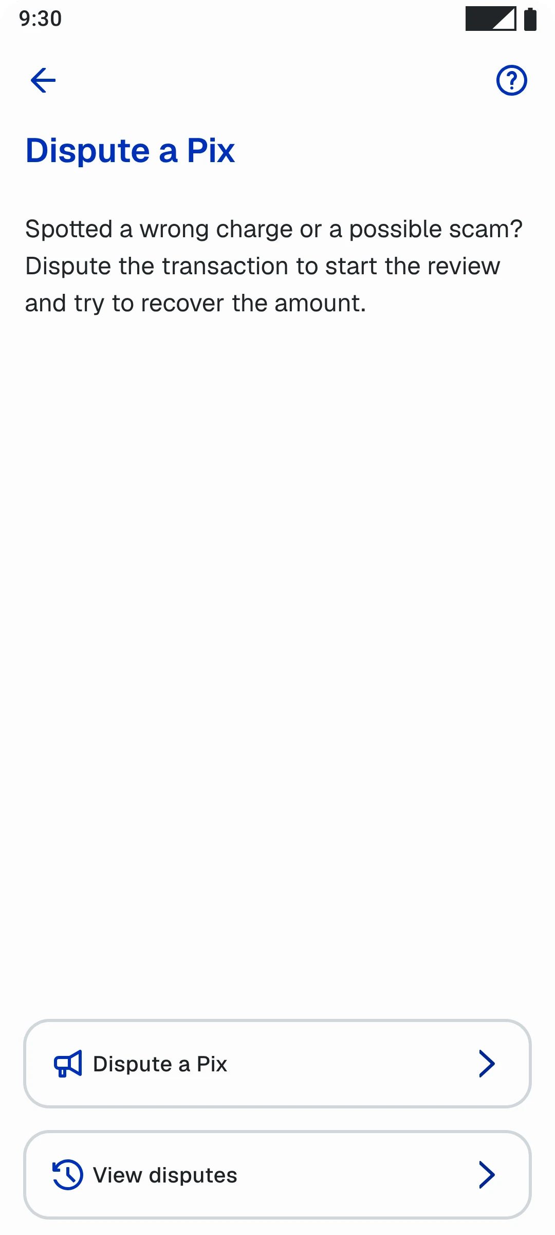
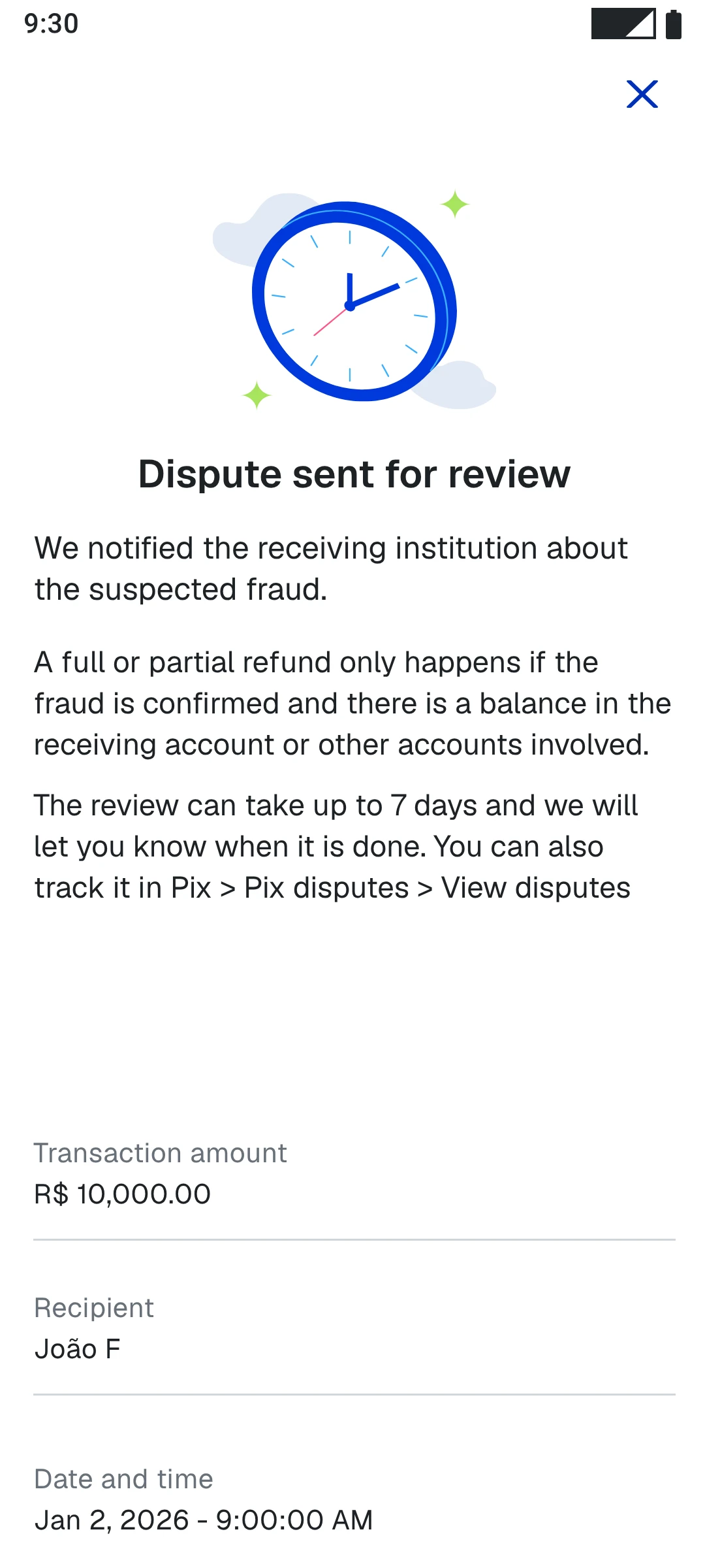
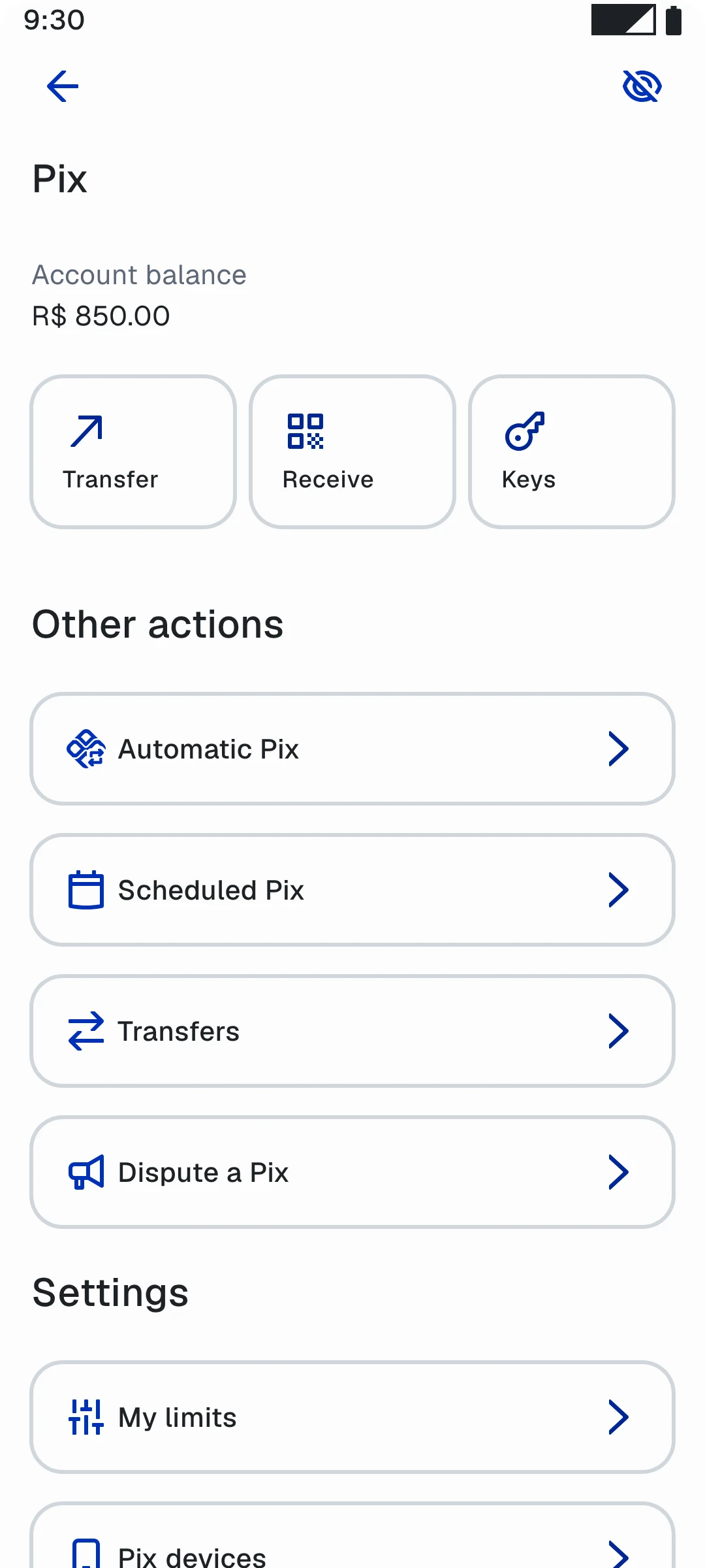
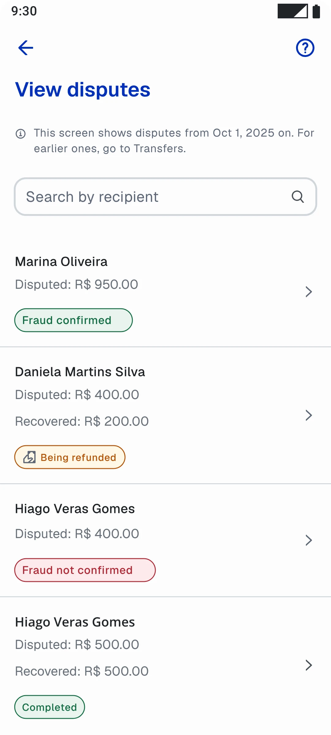
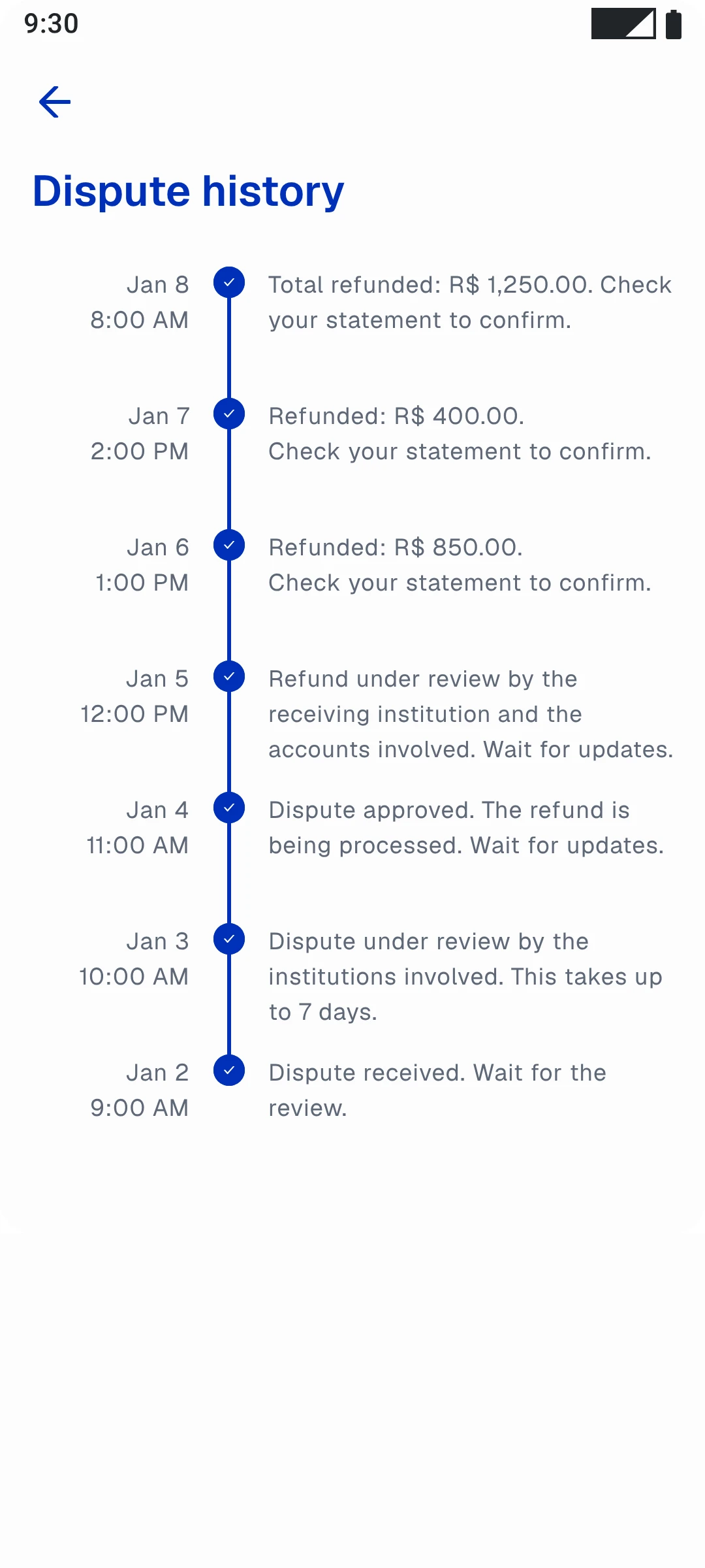
Dispute or check. Two actions, right on the first screen, with no hidden path.
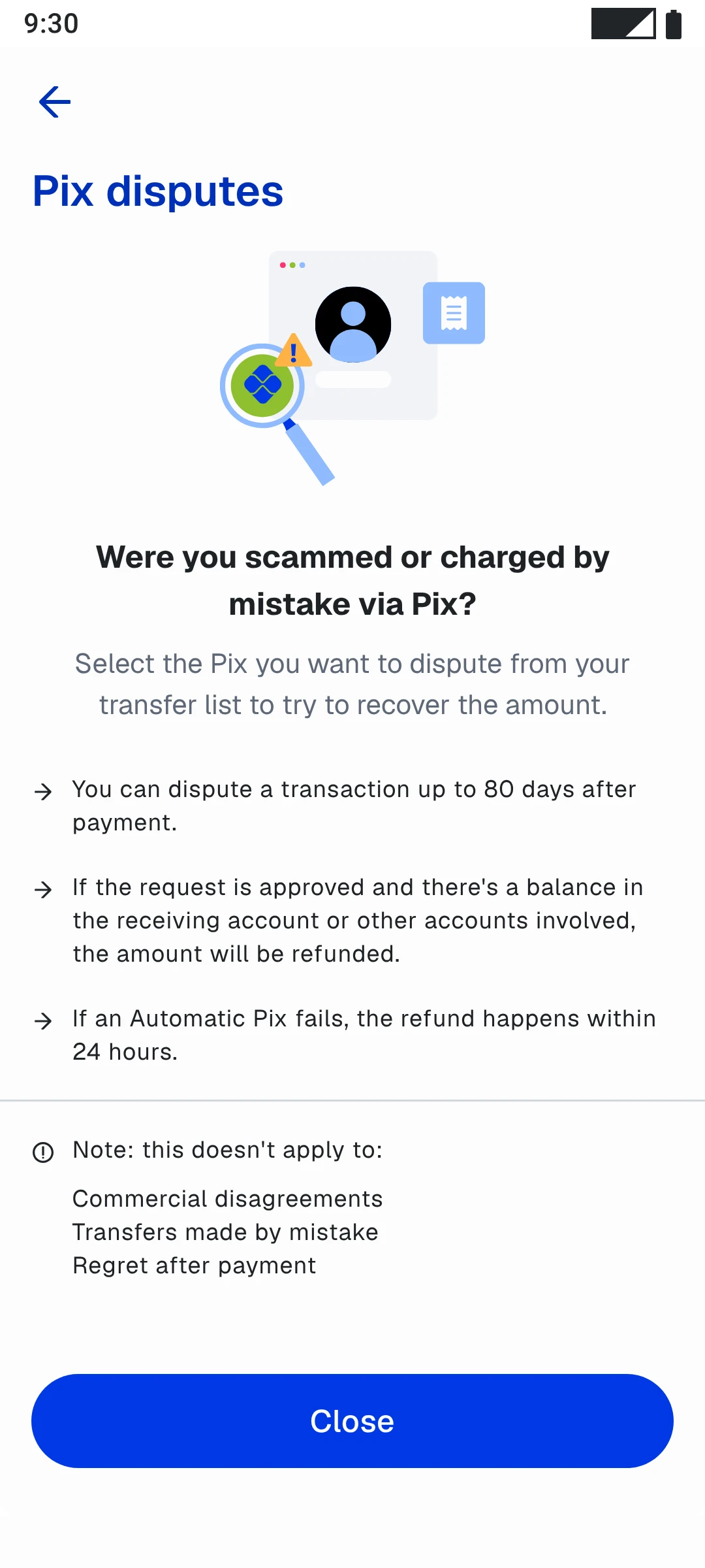
The 80-day deadline, what happens if the request is approved and the cases that don't apply. The person knows whether their case qualifies before filling in anything.
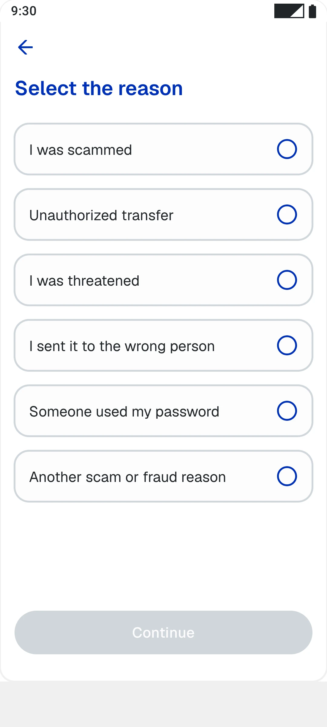
"I was scammed" instead of a technical code. Six options that cover the MED cases.
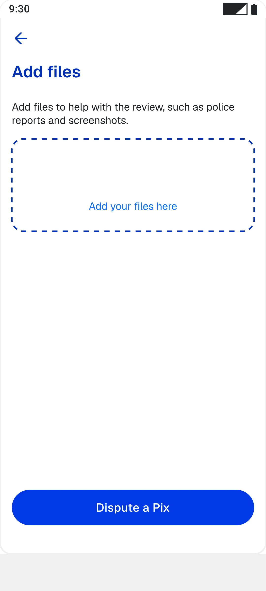
Police report and screenshots go here, in a single step.
A deadline of up to 7 days, when the money comes back and a summary of what was disputed.
In V2, the entry point sits in the Pix area, next to the other actions. Nobody has to guess where it is.
Approved, being refunded, declined or completed. The status shows in the list, without opening each one.
From receipt to final refund. This view is what took support out of the way.
And there's a third side that usually stays invisible in a case: the back-office view, used by internal compliance teams to follow each dispute proactively, without asking the product team for information every time the Central Bank asked something.
In a critical financial journey, transparency isn't a differentiator. It's the bare minimum.
The most important decision of the whole project wasn't any step of the opening flow. It was real-time tracking. It didn't just reduce ticket volume. It changed the nature of the relationship: from someone waiting for a call to someone following their own process.
Three fronts served at once: the user, support and the compliance team.
Trust isn't a consequence of a good product. It is the product.
- In moments of high emotional vulnerability, UX isn't about efficiency. It's about being present and being clear
- Status visibility reduces anxiety more than any flow simplification can
- Eligibility triage before the flow isn't friction. It's respect: people deserve to know if their case applies before filling anything in
- Regulatory compliance and good experience don't compete. When it works, they're the same thing
- The most impactful part of the project wasn't the most visible one. It was what happens after the user taps "send"